Making great strides in community mobility
Making great strides in community mobility
Making great strides in community mobility
Making great strides in community mobility
Making great strides in community mobility
Ryde Hunters Hill Community Transport
Ryde Hunters Hill Community Transport
Ryde Hunters Hill Community Transport
Ryde Hunters Hill Community Transport
Ryde Hunters Hill Community Transport
Visual identity
Rollout
Visual identity
Rollout
Visual identity
Rollout
Visual identity
Rollout
Visual identity
Rollout
Brand Writing
Tone of voice
Tone of voice
Brand Writing
Brand Writing
Brand guidelines
Brand guidelines
Brand guidelines
Brand guidelines
Brand guidelines
Project overview
Project overview
Project overview
Project overview
Project overview
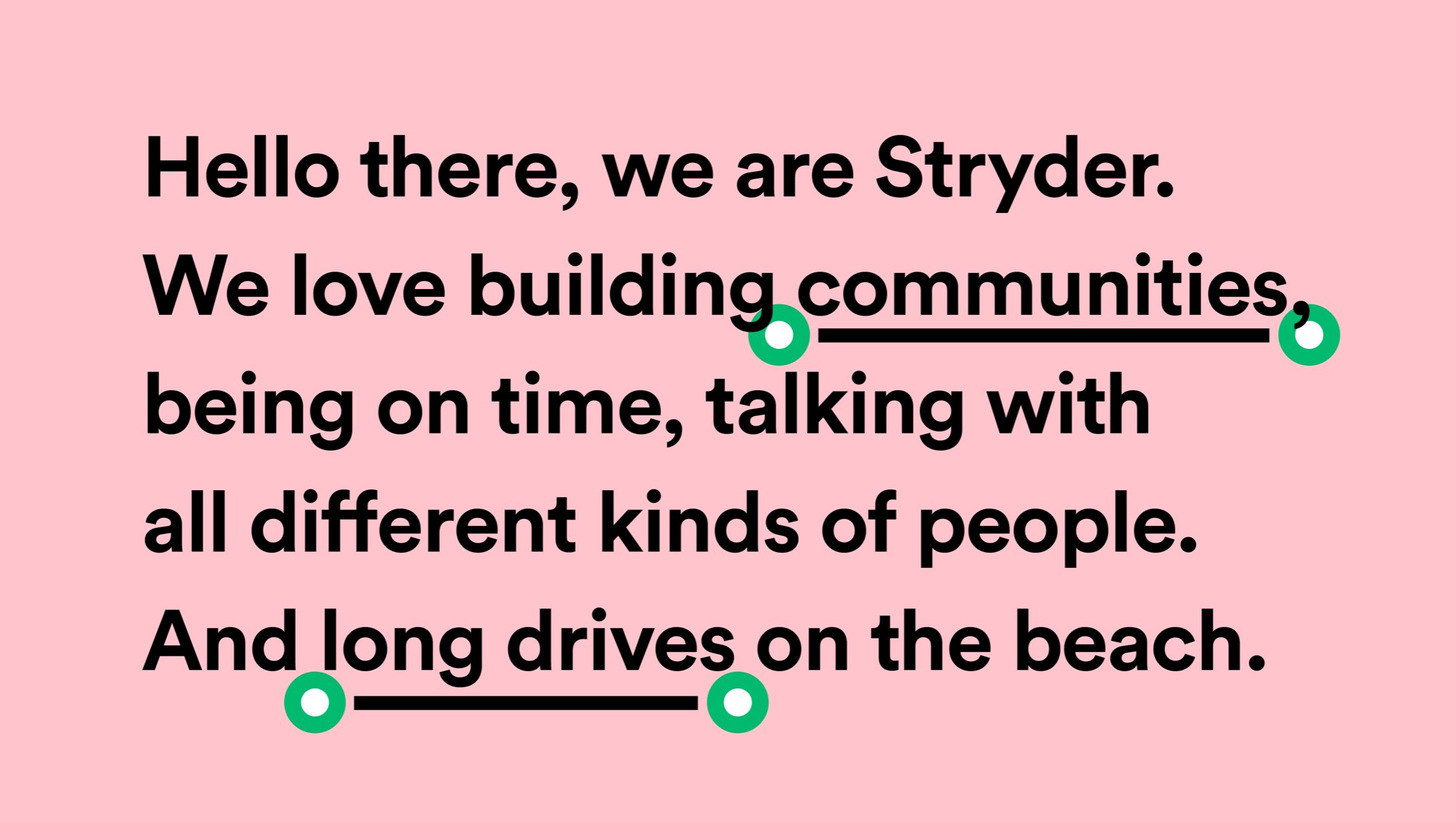
Ryde and Hunters Hill Community Transport has provided the local community in Sydney’s north-west with a service of regular social and community outings to places of interest, as well as weekly visits to local shopping centres for more than 30 years. In the face of government funding changes, it became clear that the transport service would need a new strategy and brand in order to appeal to a broader audience, to expand its services to increase organic revenue. We worked together with strategy agency MamaTray to design a completely new brand and identity for the transport service. A new name was developed, Stryder, as well as a positioning that allowed Stryder to expand its offering to new community sectors.
Ryde and Hunters Hill Community Transport has provided the local community in Sydney’s north-west with a service of regular social and community outings to places of interest, as well as weekly visits to local shopping centres for more than 30 years. In the face of government funding changes, it became clear that the transport service would need a new strategy and brand in order to appeal to a broader audience, to expand its services to increase organic revenue. We worked together with strategy agency MamaTray to design a completely new brand and identity for the transport service. A new name was developed, Stryder, as well as a positioning that allowed Stryder to expand its offering to new community sectors.
Ryde and Hunters Hill Community Transport has provided the local community in Sydney’s north-west with a service of regular social and community outings to places of interest, as well as weekly visits to local shopping centres for more than 30 years. In the face of government funding changes, it became clear that the transport service would need a new strategy and brand in order to appeal to a broader audience, to expand its services to increase organic revenue. We worked together with strategy agency MamaTray to design a completely new brand and identity for the transport service. A new name was developed, Stryder, as well as a positioning that allowed Stryder to expand its offering to new community sectors.
Ryde and Hunters Hill Community Transport has provided the local community in Sydney’s north-west with a service of regular social and community outings to places of interest, as well as weekly visits to local shopping centres for more than 30 years. In the face of government funding changes, it became clear that the transport service would need a new strategy and brand in order to appeal to a broader audience, to expand its services to increase organic revenue. We worked together with strategy agency MamaTray to design a completely new brand and identity for the transport service. A new name was developed, Stryder, as well as a positioning that allowed Stryder to expand its offering to new community sectors.
Ryde and Hunters Hill Community Transport has provided the local community in Sydney’s north-west with a service of regular social and community outings to places of interest, as well as weekly visits to local shopping centres for more than 30 years. In the face of government funding changes, it became clear that the transport service would need a new strategy and brand in order to appeal to a broader audience, to expand its services to increase organic revenue. We worked together with strategy agency MamaTray to design a completely new brand and identity for the transport service. A new name was developed, Stryder, as well as a positioning that allowed Stryder to expand its offering to new community sectors.

Our idea
Our idea
Our idea
Our idea
Our idea
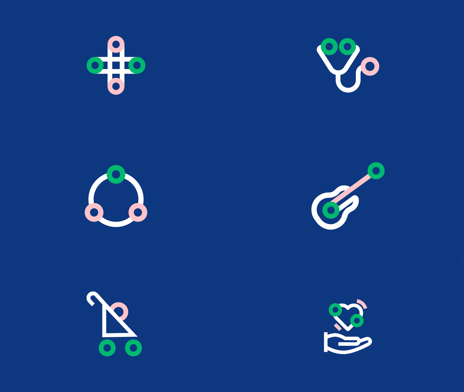
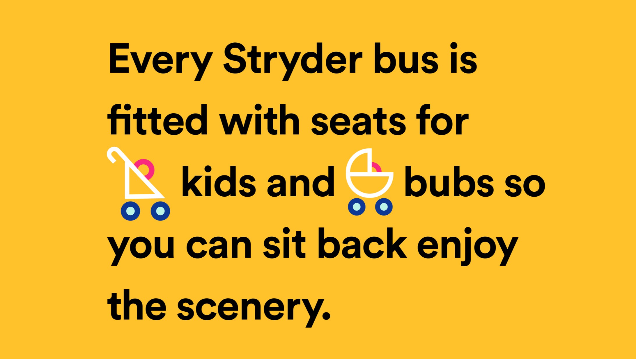
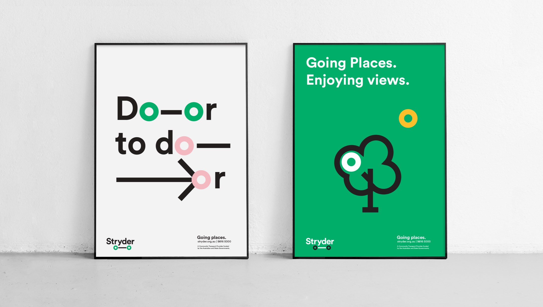
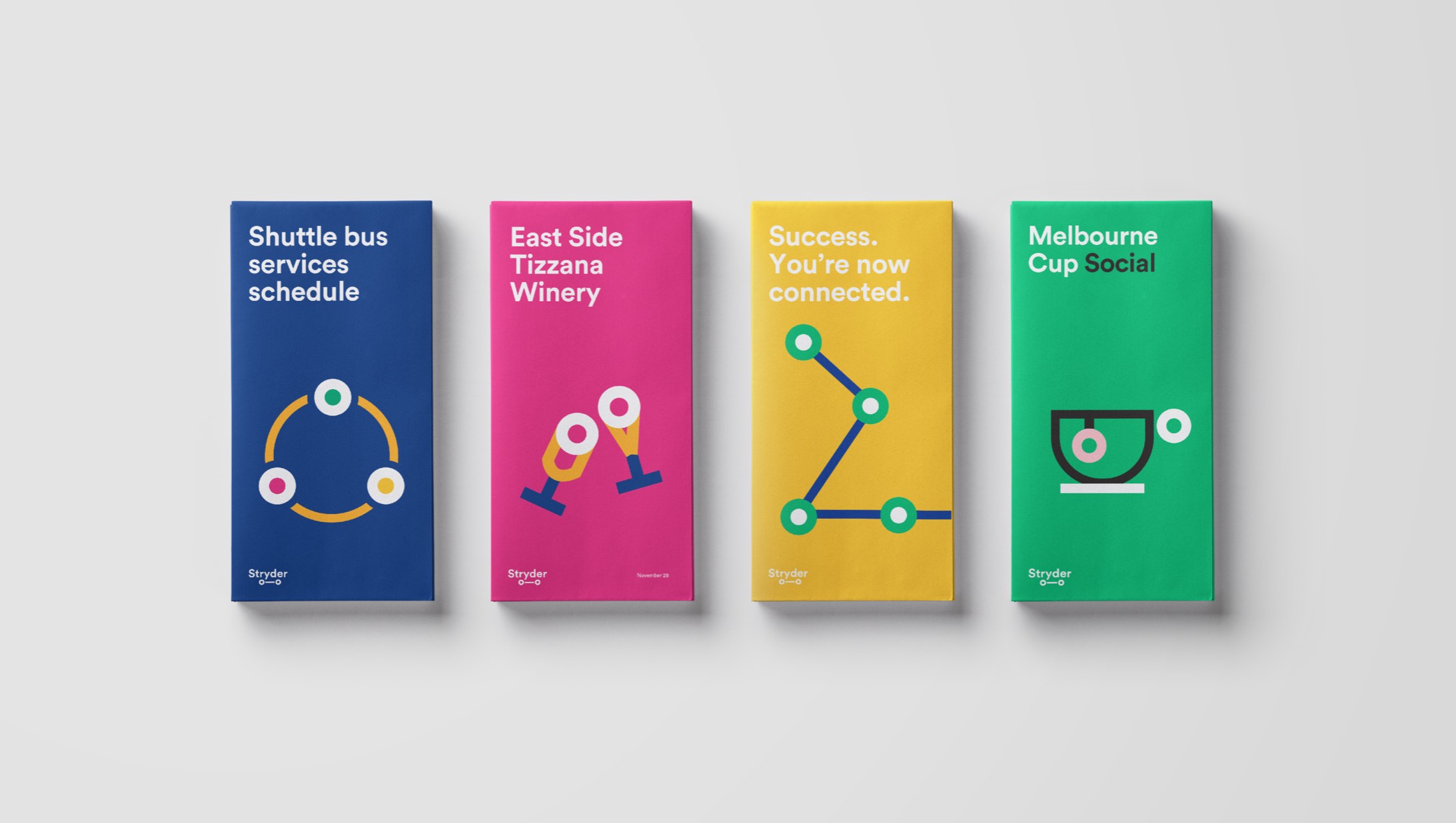
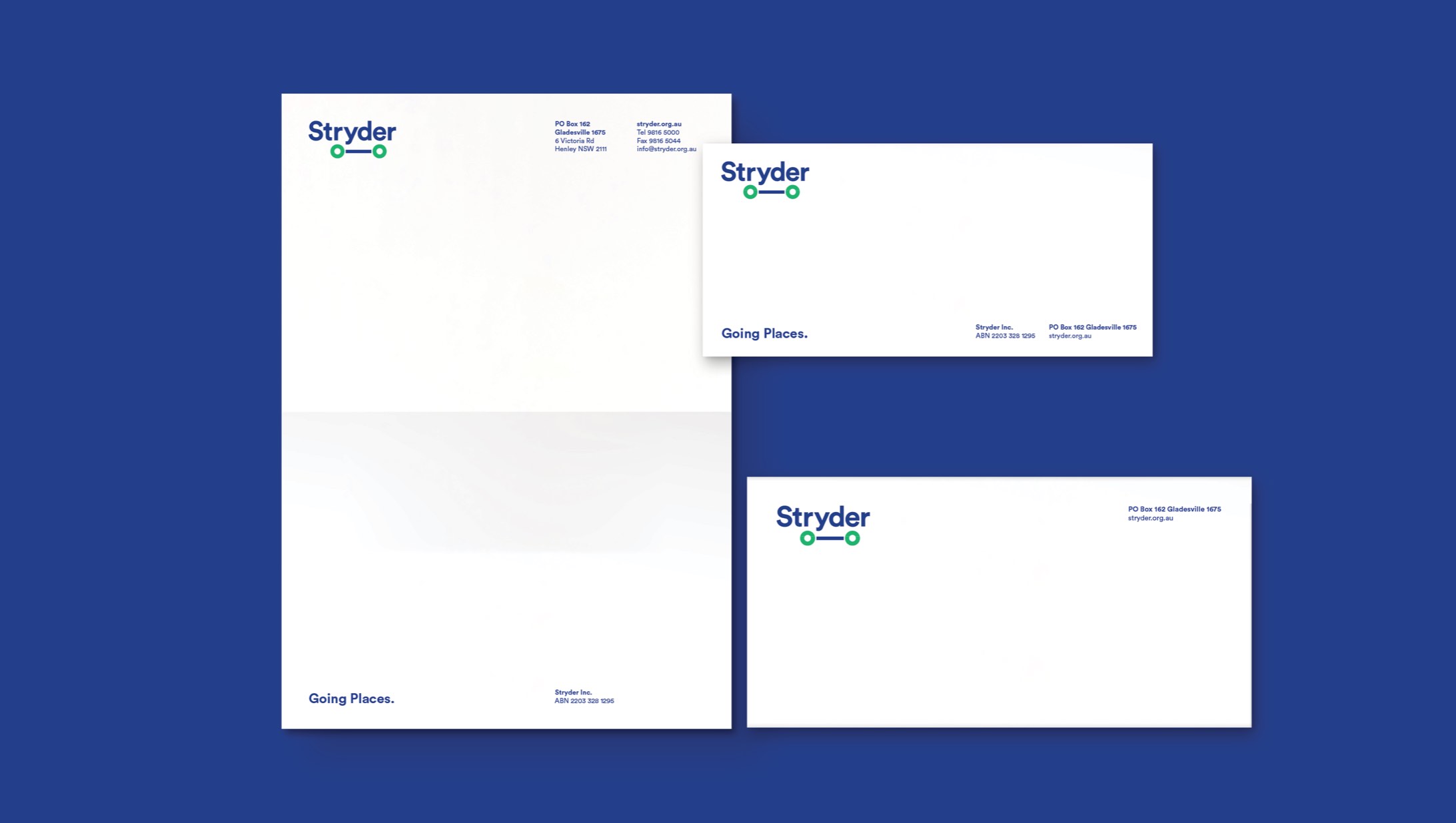
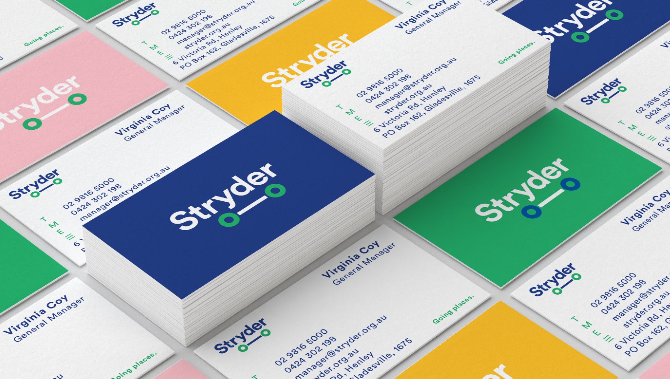
In order to move away from some of the negative perceptions surrounding community transport a totally new brand was developed to open up the services’ appeal from seniors and people living with disability to the broader community. An inclusive and diverse tone was created to allow for positive and enabling communications. A complete brand system was developed, including icons, type treatments, photo style and a vibrant colour palette to emphasise mobility and the connectivity that the Stryder service provides.
In order to move away from some of the negative perceptions surrounding community transport a totally new brand was developed to open up the services’ appeal from seniors and people living with disability to the broader community. An inclusive and diverse tone was created to allow for positive and enabling communications. A complete brand system was developed, including icons, type treatments, photo style and a vibrant colour palette to emphasise mobility and the connectivity that the Stryder service provides.
In order to move away from some of the negative perceptions surrounding community transport a totally new brand was developed to open up the services’ appeal from seniors and people living with disability to the broader community. An inclusive and diverse tone was created to allow for positive and enabling communications. A complete brand system was developed, including icons, type treatments, photo style and a vibrant colour palette to emphasise mobility and the connectivity that the Stryder service provides.
In order to move away from some of the negative perceptions surrounding community transport a totally new brand was developed to open up the services’ appeal from seniors and people living with disability to the broader community. An inclusive and diverse tone was created to allow for positive and enabling communications. A complete brand system was developed, including icons, type treatments, photo style and a vibrant colour palette to emphasise mobility and the connectivity that the Stryder service provides.
In order to move away from some of the negative perceptions surrounding community transport a totally new brand was developed to open up the services’ appeal from seniors and people living with disability to the broader community. An inclusive and diverse tone was created to allow for positive and enabling communications. A complete brand system was developed, including icons, type treatments, photo style and a vibrant colour palette to emphasise mobility and the connectivity that the Stryder service provides.

Acknowledgements
Acknowledgements
Acknowledgements
Acknowledgements
Brand strategy/tov and naming
MamaTray
Brand strategy/tov and naming
MamaTray
Brand strategy/tov and naming
MamaTray
Brand strategy/tov and naming
MamaTray
Brand strategy/tov and naming
MamaTray
Next - SEN Herbal tea
Next - SEN Herbal tea
Next - SEN Herbal tea
Next - SEN Herbal tea
Next - SEN Herbal tea
© YSN Studios PTY Ltd
