Lending NSW’s leading environmental regulator the authority to protect the state from pollution and waste
Lending NSW’s leading environmental regulator the authority to protect the state from pollution and waste
Lending NSW’s leading environmental regulator the authority to protect the state from pollution and waste
Lending NSW’s leading environmental regulator the authority to protect the state from pollution and waste
Lending NSW’s leading environmental regulator the authority to protect the state from pollution and waste
NSW Environment Protection Authority
NSW Environment Protection Authority
Visual identity
Brand rollout
Visual identity
Brand rollout
Template suite
Icon suite
Template suite
Icon suite
Template suite
Icon suite
Template suite
Icon suite
Brand guidelines
Brand guidelines
Project overview
Project overview
Project overview
Project overview
Project overview
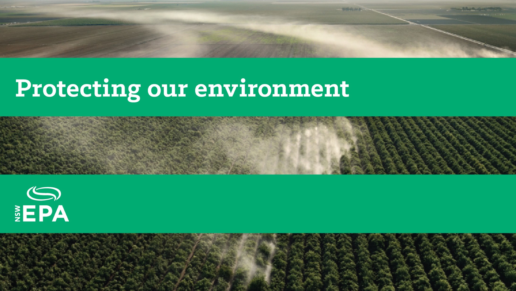
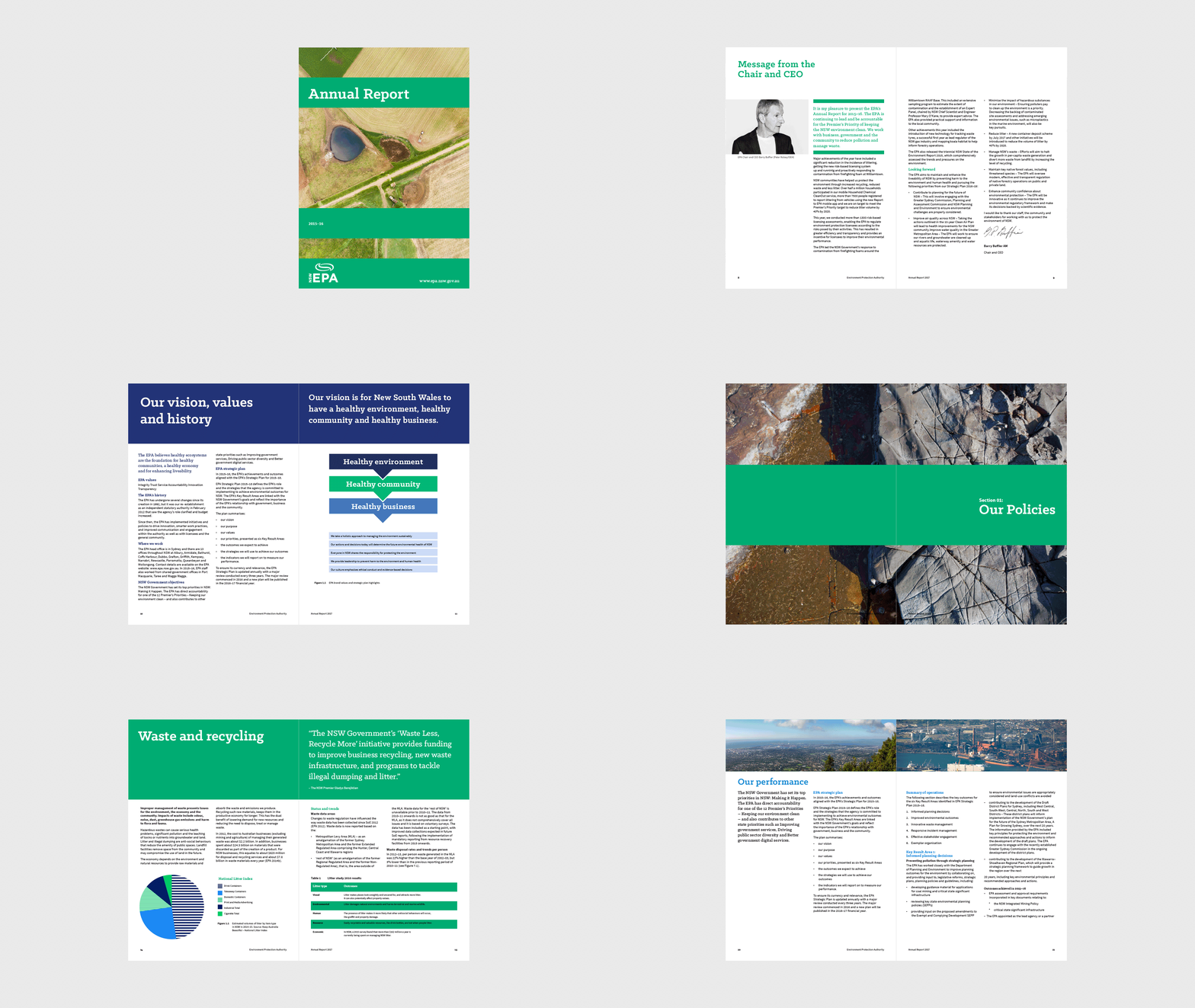
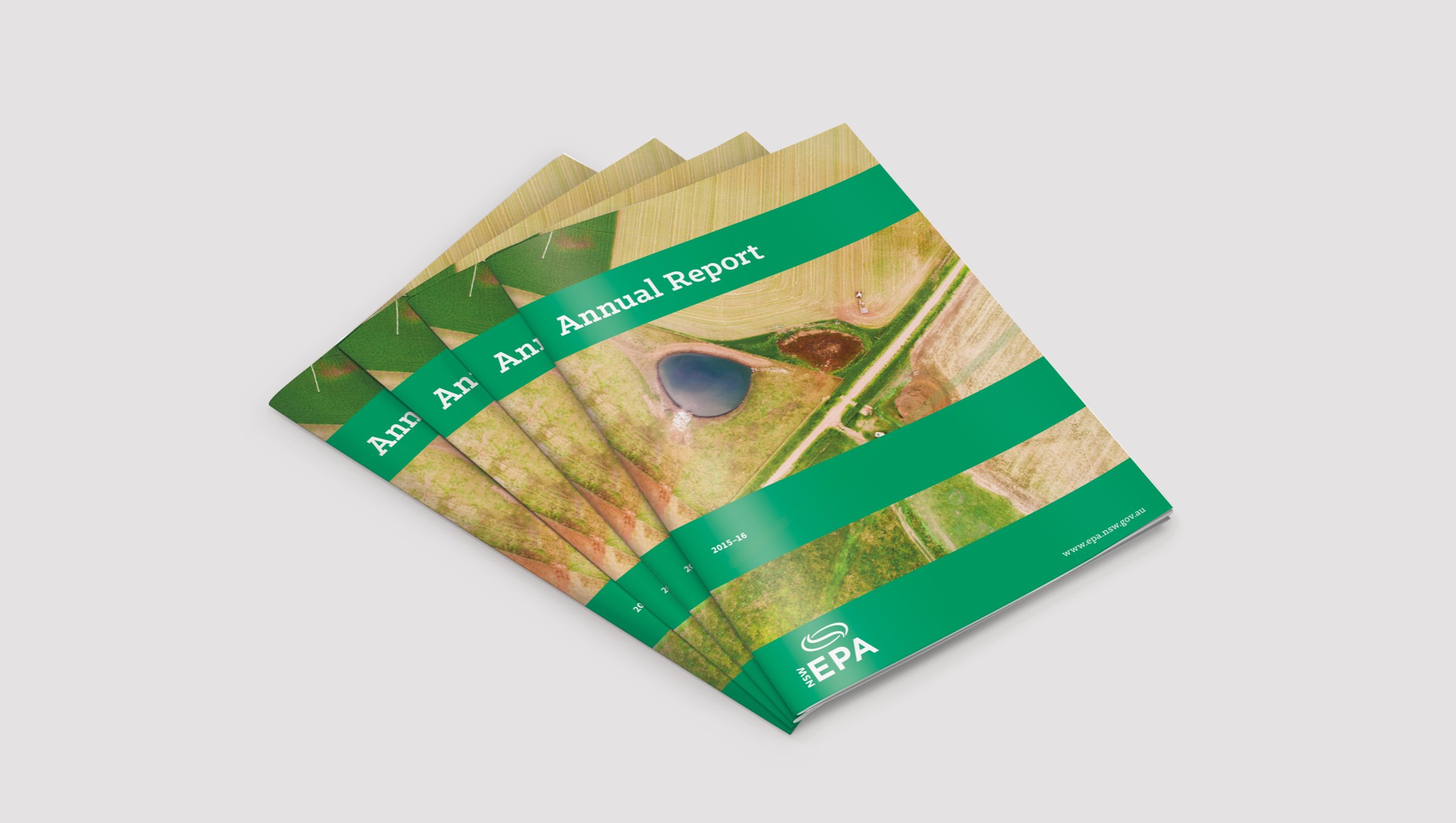
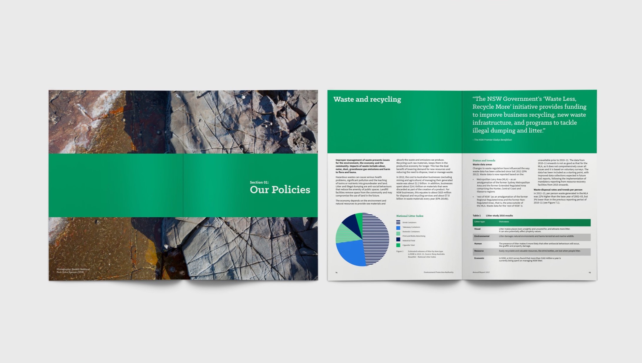
The New South Wales Environment Protection Authority (EPA) is the state’s primary environmental regulator. The EPA partners with a wide variety of business and government bodies as well as the community to reduce pollution and waste and prevent degradation of the environment. They came to us in 2017 looking to refresh their tired brand in a bold and confident way. It needed to appeal to a broad audience, be accessible for all, and importantly be easy to template and implement for thousands of in house designers and partners across the state who would be using the brand. They wished to maintain their current logo as the cost to replace signage across NSW would be prohibitive, so an identity system was required that could make the most of the existing logo.
The New South Wales Environment Protection Authority (EPA) is the state’s primary environmental regulator. The EPA partners with a wide variety of business and government bodies as well as the community to reduce pollution and waste and prevent degradation of the environment. They came to us in 2017 looking to refresh their tired brand in a bold and confident way. It needed to appeal to a broad audience, be accessible for all, and importantly be easy to template and implement for thousands of in house designers and partners across the state who would be using the brand. They wished to maintain their current logo as the cost to replace signage across NSW would be prohibitive, so an identity system was required that could make the most of the existing logo.
The New South Wales Environment Protection Authority (EPA) is the state’s primary environmental regulator. The EPA partners with a wide variety of business and government bodies as well as the community to reduce pollution and waste and prevent degradation of the environment. They came to us in 2017 looking to refresh their tired brand in a bold and confident way. It needed to appeal to a broad audience, be accessible for all, and importantly be easy to template and implement for thousands of in house designers and partners across the state who would be using the brand. They wished to maintain their current logo as the cost to replace signage across NSW would be prohibitive, so an identity system was required that could make the most of the existing logo.
The New South Wales Environment Protection Authority (EPA) is the state’s primary environmental regulator. The EPA partners with a wide variety of business and government bodies as well as the community to reduce pollution and waste and prevent degradation of the environment. They came to us in 2017 looking to refresh their tired brand in a bold and confident way. It needed to appeal to a broad audience, be accessible for all, and importantly be easy to template and implement for thousands of in house designers and partners across the state who would be using the brand. They wished to maintain their current logo as the cost to replace signage across NSW would be prohibitive, so an identity system was required that could make the most of the existing logo.
The New South Wales Environment Protection Authority (EPA) is the state’s primary environmental regulator. The EPA partners with a wide variety of business and government bodies as well as the community to reduce pollution and waste and prevent degradation of the environment. They came to us in 2017 looking to refresh their tired brand in a bold and confident way. It needed to appeal to a broad audience, be accessible for all, and importantly be easy to template and implement for thousands of in house designers and partners across the state who would be using the brand. They wished to maintain their current logo as the cost to replace signage across NSW would be prohibitive, so an identity system was required that could make the most of the existing logo.
Our idea
Our idea
Our idea
Our idea
Our idea
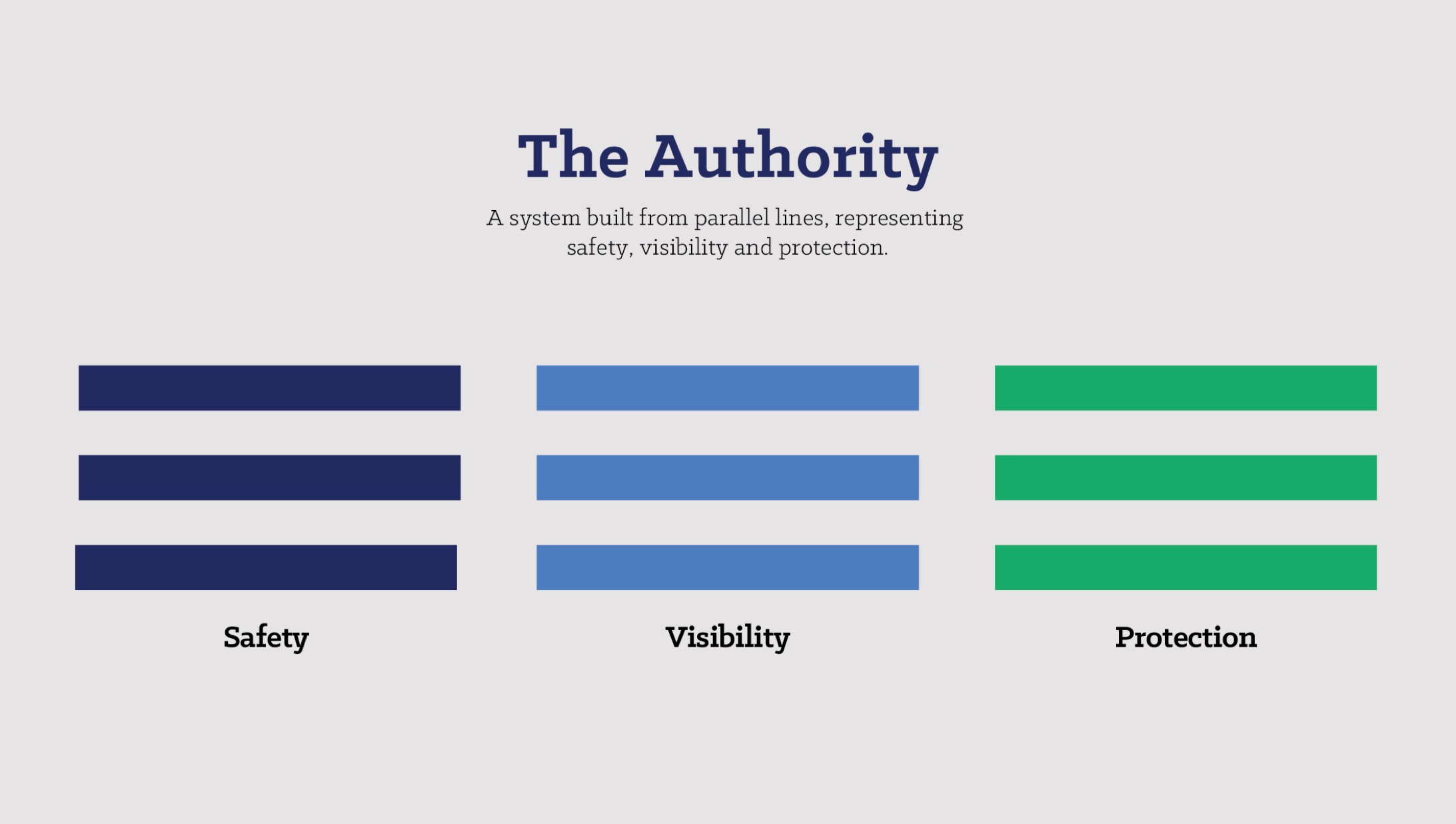
We helped the EPA to delineate core strategic pillars to clarify their brands’ positioning. They wished to dial up the authoritarian end of their brand values, to emphasise their power to effect change and mandate laws to protect the environment. We wanted to make sure that the brand felt trustworthy and respected, committed to public good and firm but fair.
We helped the EPA to delineate core strategic pillars to clarify their brands’ positioning. They wished to dial up the authoritarian end of their brand values, to emphasise their power to effect change and mandate laws to protect the environment. We wanted to make sure that the brand felt trustworthy and respected, committed to public good and firm but fair.
We helped the EPA to delineate core strategic pillars to clarify their brands’ positioning. They wished to dial up the authoritarian end of their brand values, to emphasise their power to effect change and mandate laws to protect the environment. We wanted to make sure that the brand felt trustworthy and respected, committed to public good and firm but fair.
We helped the EPA to delineate core strategic pillars to clarify their brands’ positioning. They wished to dial up the authoritarian end of their brand values, to emphasise their power to effect change and mandate laws to protect the environment. We wanted to make sure that the brand felt trustworthy and respected, committed to public good and firm but fair.
We helped the EPA to delineate core strategic pillars to clarify their brands’ positioning. They wished to dial up the authoritarian end of their brand values, to emphasise their power to effect change and mandate laws to protect the environment. We wanted to make sure that the brand felt trustworthy and respected, committed to public good and firm but fair.

Visual identity
Visual identity
Visual identity
Visual identity
Visual identity
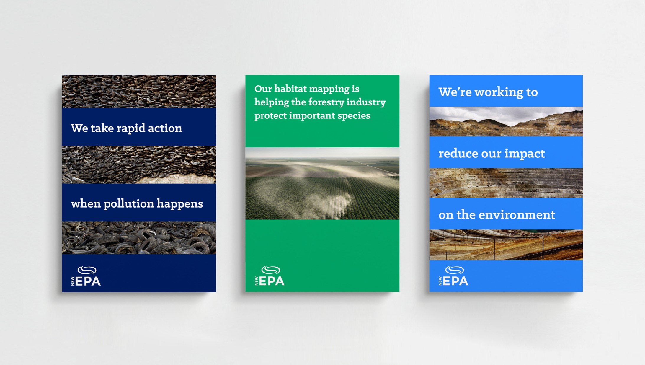
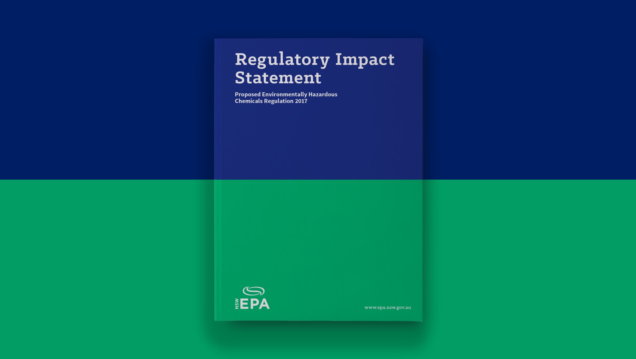
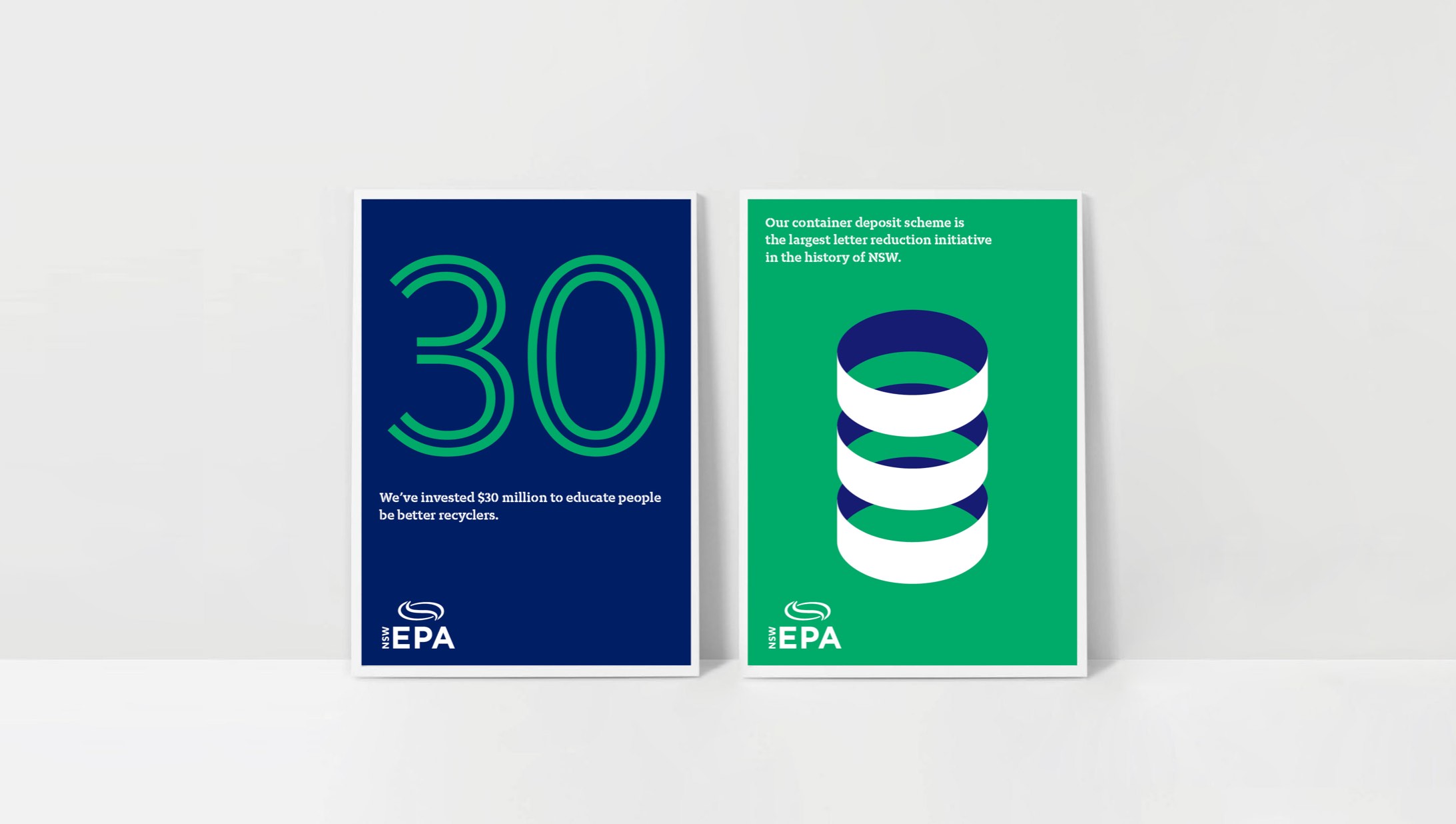
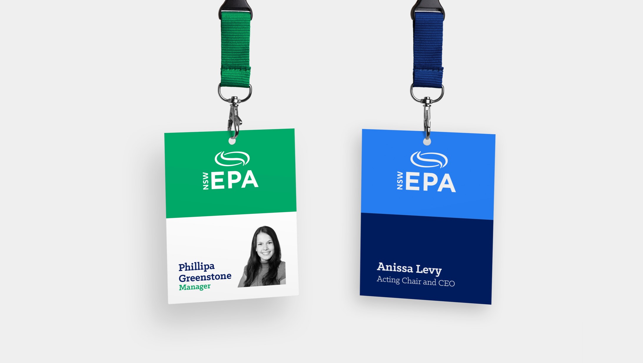
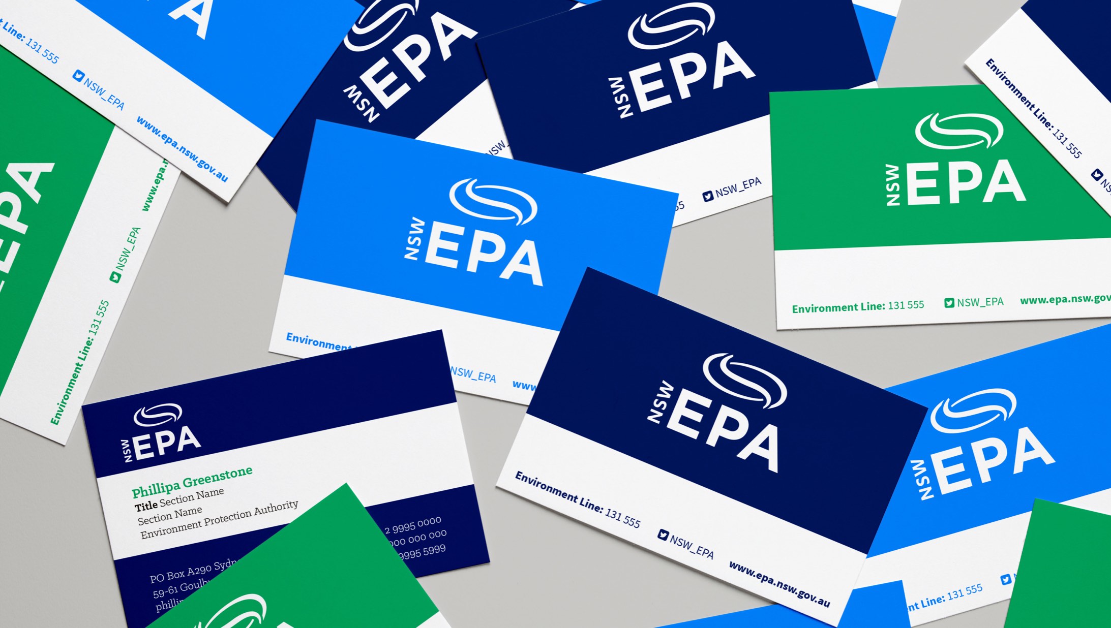
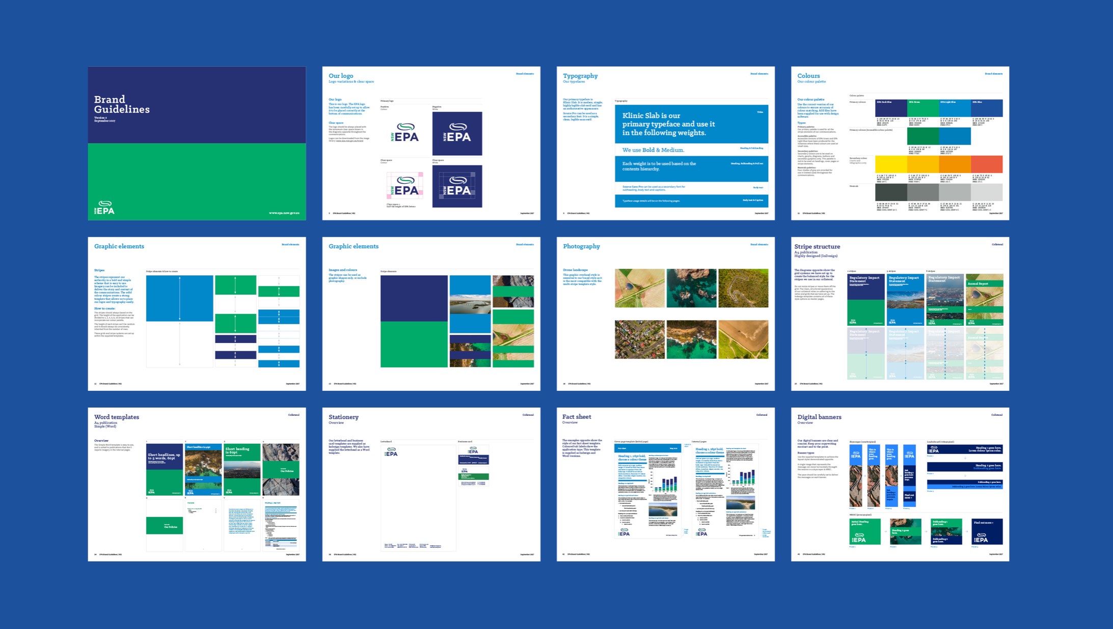
We built their brand around a system based on parallel lines and stripes, which as a visual language are often used in contexts to connote safety, visibility and protection. We created a stripe-based illustration, iconography and typography style as an element of the visual identity that allowed for the creation of more bespoke applications.
We built their brand around a system based on parallel lines and stripes, which as a visual language are often used in contexts to connote safety, visibility and protection. We created a stripe-based illustration, iconography and typography style as an element of the visual identity that allowed for the creation of more bespoke applications.
We built their brand around a system based on parallel lines and stripes, which as a visual language are often used in contexts to connote safety, visibility and protection. We created a stripe-based illustration, iconography and typography style as an element of the visual identity that allowed for the creation of more bespoke applications.
We built their brand around a system based on parallel lines and stripes, which as a visual language are often used in contexts to connote safety, visibility and protection. We created a stripe-based illustration, iconography and typography style as an element of the visual identity that allowed for the creation of more bespoke applications.
We built their brand around a system based on parallel lines and stripes, which as a visual language are often used in contexts to connote safety, visibility and protection. We created a stripe-based illustration, iconography and typography style as an element of the visual identity that allowed for the creation of more bespoke applications.


Acknowledgements
Acknowledgements
Acknowledgements
Acknowledgements
Acknowledgements
Illustrator
Karan Singh
Illustrator
Karan Singh
Illustrator
Karan Singh
Illustrator
Karan Singh
© YSN Studios PTY Ltd
